Hi,


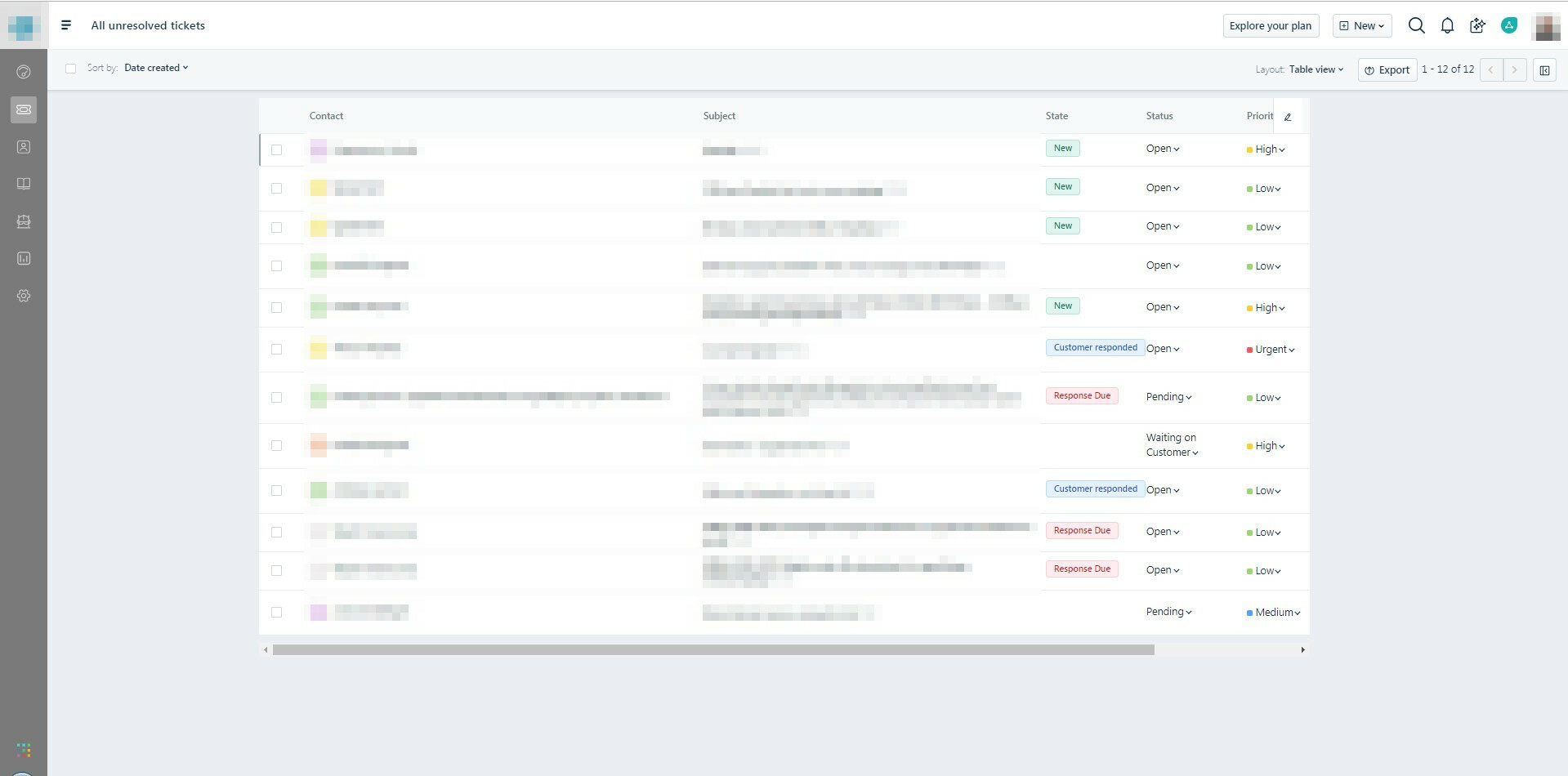
When large browser window while using the table view, it automatically adds spacing on the left and right. This causes the table to end up smaller!

This is highly annoying, especially as I can't adjust the size or order of each column. 


Another issue is that, when hovering over the status, the row gets slightly larger until filter gets refreshed.


This is a big issue for us also.

When zooming the browser to anything less than 90%, instead of getting a wider view of the column, a smaller window is created with big blank spaces around it.

Please enable us to resize / zoom out and the ticket table view adjust correctly with the zooming/resizing.


See attached image

zoomout_38942.jpg

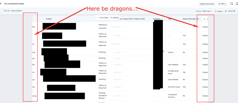
I have to zoom out to 70-80% if I want to see my table, with all the columns I require to be visible. I accept that I am using a lot of columns here, but I have an exceptionally widescreen monitor, and wish to take advantage of it. In it's current format, even just adding one or two more columns means the table no extends out of view because the sides do not scale with the webpage at all. The only way to get over to that data is to literally click and drag across the text on the screen... 


I realize development on features and bugs is determined by scope and desire from the customer base, and I can see that this topic isn't growing a lot of legs, but this seems like a very basic optimization. Is there anyway that some bored CSS dev can take 5 mins to configure this table so that it scales with the columns selected? 


theedgeo_27themap_39300.jpg

+1 here.


An official response would be nice.

This is very annoying issue that reduces our productivity.


@Bgh@Adam@Craig@Leo, We'll be soon working on making the ticket list page experience better and this is the #1 item that we want to fix as a part of the revamp.


Cheers!


+1


any updates?


@Nino,

We do not have an ETA on this yet. Please stay tuned to our product updates to know when this is released.

Cheers!


Reply