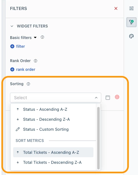


I want to be able to see my Graphs in analytics in a different order. Right now, all graphs put the smallest number of tickets included on the graph parameters in the most prominent place, I want to see highest number of tickets first but there’s no way to change the order the information is shown in.
When all I want are totals for the sake of totals, it’s fine. But it doesn’t work for all things.
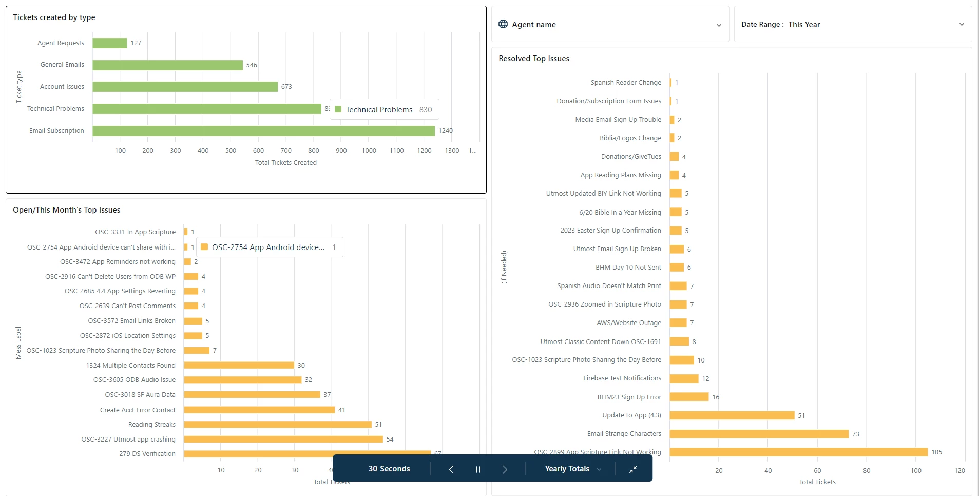
Use case: The orange bar graphs are meant to show “top issues” but it starts with the “issues” that have the smallest number of tickets attached - this is counterproductive since the top of the list should be the biggest issues. The people I report to really don’t appreciate that the info they are most interested in is on the bottom of the graph and that they have to work their way up the list - it’s just a little silly.