



New Idea

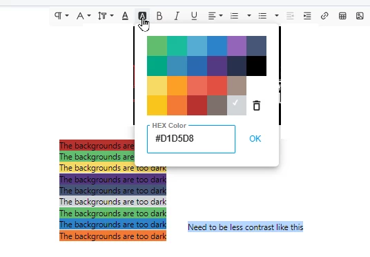
Background Color too dark - Needs to be less contrast

Related products:Freshdesk
  • September 11, 2024
  • 1 reply
  • 35 views

Altus
Skilled Expert
Forum|alt.badge.img+4


  • The background colour is used to highlight headings and text that needs to stand out.  But in doing that, makes it actually harder to read.
  • The background colours need to be a lot lighter, less contrast. 
  • Or even better customizable so you can customize the colours to go with your company colours/brand.
  • The only colours that are OK are the light yellow and the light grey.


I am using Freshdesk… 
Key Words Background colour (nz) Background color (us)

1 reply

Forum|alt.badge.img
  • Contributor
  • September 12, 2024

This must be solved with pastel colors or a wider range of them (as it was before) as it’s very annoying.

When applying the background color we are forced to always choose the yellow one … as all the others make the black text unreadable😏.