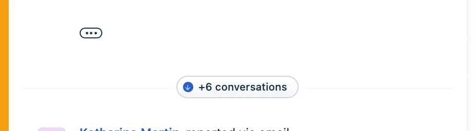



Some people on my team have a hard time noticing the collapsed items button. They scroll right past it and then are confused when they can’t find the item they’re looking for. Please make it larger, bolder, more colorful. Anything to make it more obvious that it’s there.