

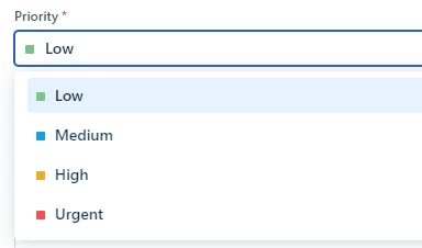
I have been creating several reports in FreshService for my security team - the reports look great, but one of the things I want to display is the quantity of tickets by Priority. I have worked to ensure that the color of each aligns with the same color that is used by FreshService - so everything looks consistent throughout the product. However, I noticed that there doesn’t appear to be a way to make the order of the priority consistent. Ideally, I’d like to rank the tickets in the same manner that FreshService does (eg Low, Med, High, Urgent). However, I have noticed that FreshService isn’t using that order and I cannot locate a way to even specify it within the reporting module -- unfortunately, this leads to inconsistencies and the legends aren’t even consistent within the same report amongst different graphs.
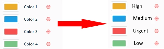
Here’s the color that FreshService assigns each priority
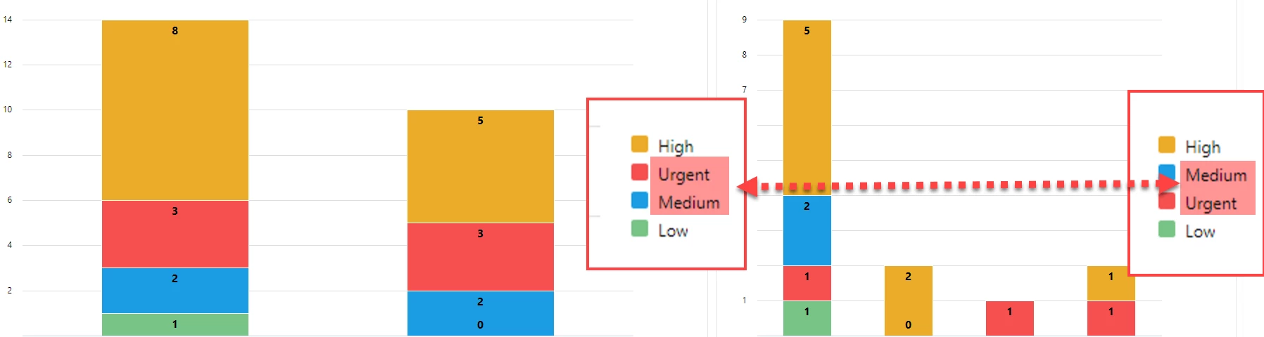
As you can see in the screenshot below, I have two different charts showing very similar data, but even amongst these two charts, the priorities do not align
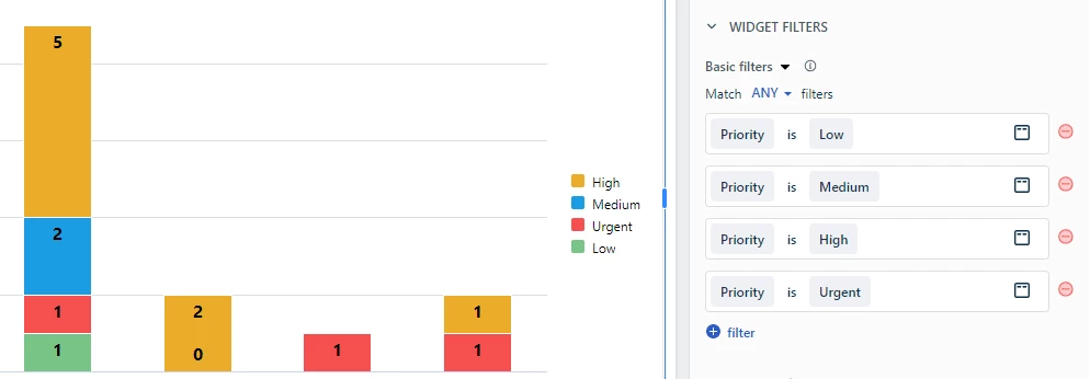
I have tried to do some stuff with the Widget filters to attempt to get the priority order aligned, but it makes no difference
Because I took the time to ensure that the report colors match those of FreshService, I could remove the legend and it would be fine - but there’s also no way to remove the legend from the report.
My Ideas:
- Allow for us to modify the legend order -- perfect for priorities / categories - anything where order is important
- Allow us to remove the legend if desired -- again, perfect for these “known” data labels
- Allow us to modify the color name in the palette