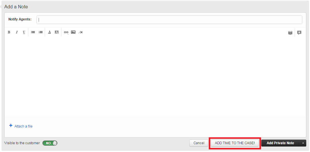
I found a few things about the timer that we are not crazy about.
1. I think it's hard to remember to start the timer on tickets with it so far down the right sidebar.
2. I think with the lack of the display of seconds in the timer that it is difficult to see that the timer is running.
So I modified the FreshPlug that I found that moves the redactor up on the left side of the page. I adapted that to the section of the right sidebar that holds the timer.
In addition to the jQuery that is used to move the div, I also applied some css to the timer. This styles the timer to be red with ** next to it while time is running and back to black when the timer is stopped or when time is "saved". This makes it easier to remember that there is time running or that it needs to be started up.
- I also added a few lines of css to tighten up the padding of the elements in the ticket properties section of the sidebar, so remove those if you don't like them.
If you have suggestions about how this could be bettered, please post them. I hope this is usful for someone other than me.


