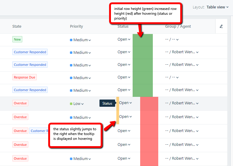
I am using Windows 10 and Chrome and noticed these 2 minor layout glitches when mouse hovering the dropdown in the status or priority columns.
The row height gets increased by a few pixels and the status slightly jumps to the right.

Nothing that stops us from working, just feels a bit "janky". And maybe it's easy to fix for you.


