How do we enable the chat to work in the Quick Question section?
For some reason when I tried to use this theme, when a user was not logged in it would not show the login button or links.
Hi Rob,
Could you please try disabling your Single Sign on option temporarily to access your login page?
Thank you
I found the big, when solutions and forums were set to logged in users only it would but out the home page.
I think it would be great to use this theme as the default theme (with a choice for current customers), so that people who are not on the Estate plan can still enjoy it.
I still dont get why theming is only available to people subscribed to the top level, surely as it is something which is a manual process for the administrator to set up it should be free for anyone to do as it adds 0 overhead to the service freshdesk provide. I could possibly understand payment if it was an automatic process like wordpress where you just clicked a button and it installed multiple themes so you can easily switch between. Even if this was the case I would still not really expect it to be only available to the estate plans as it is a common thing that everyone with a helpdesk with yourself should be able to do.
Is there any reasoning as to why this functionality is restricted to estate plans only? (other than an incentive to get people to upgrade)
Is there a reason the Freshchat would not be working for our site? support.paylinedata.com
Thank you!
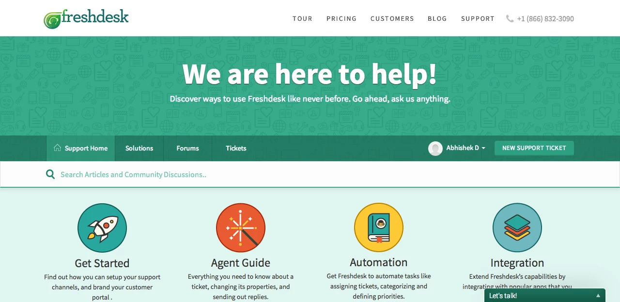
It appears that the header.txt file is broke on this. It doesn't appear at all like the demo.
Hi Josh,
The header.txt file didn't save the raw code. You can view it if you open the file in Dreamweaver or another HTML editor. The actual code that works is:
<header class="banner header-menu">
<div class="banner-wrapper">
<div class="nav-wrapper">
<a href="#" class="logo"></a>
<a data-toggle-dom="#header-tabs" id="menu-icon" href="#" data-animated="true" class="mobile-icon-nav-menu show-in-mobile"></a>
<nav class="nav-menu" id="header-tabs">
<ul>
<li class="nav-menu-title"><a href="#" class="nav-links">Opt 1</a></li>
<li class="nav-menu-title"><a href="#" class="nav-links">Opt 2</a></li>
<li class="nav-menu-title"><a href="#" class="nav-links">Opt 3</a></li>
<li class="nav-menu-title"><a href="#" class="nav-links">Opt 4</a></li>
<li class="nav-menu-title"><a href="#" class="nav-links">Opt 5</a></li>
<li class="nav-contact"><i class="icon-call"></i>(Phone number)</li>
</ul>
</nav>
</div>
</div>
</header>
{% if portal.current_tab == "home" %}
<div class="portal-banner">
<h1> We are here to help! </h1>
<p> Discover ways to use support portal like never before. Go ahead, ask us anything. </p>
</div>
{% endif %}
<div id="sticky_anchor"></div>
<div id="sticky_head">
<nav class="page-tabs action-bar" >
{% if portal.tabs.size > 0 %}
<a href="/support/home" class="help-center-tab show-in-mobile">Support Home</a>
<a data-toggle-dom="#page-tabs" id="menu-icon" href="#" data-animated="true" class="mobile-icon-nav-menu show-in-mobile"></a>
<div class="action-bar-wrapper">
<div class="nav-link" id="page-tabs">
{% for tab in portal.tabs %}
{% if tab.url %}
<a class="{% if tab.tab_type == portal.current_tab %}active{% endif %}" href="{{tab.url}}">
{% if tab.label == 'Home' %}
<i class="icon-home for-not-mobile"></i>{{ "Support Home" }}
{% else %}
{{ tab.label }}
{% endif %}
</a>
{% endif %}
{% endfor %}
<div id="new-ticket-button" class="show-in-mobile">
{% if portal.has_user_signed_in == true %}
<a href="{{ portal.new_ticket_url }}">New Support Ticket</a>
<a href="{{ portal.profile_url }}">Edit Profile</a>
<a href="{{ portal.logout_url }}">Sign Out</a>
{% else %}
<a href="{{ portal.login_url }}">Login</a>
<a href="{{ portal.new_ticket_url }}">New Support Ticket</a>
{% endif %}
</div>
</div>
<div id="new-ticket-button" class="for-not-mobile">
{% if portal.has_user_signed_in == true %}
{% if portal.user.profile_url != false %}
<img class="profile-picture" src="{{ portal.user.profile_url }}" />
{% else %}
<img class="profile-picture" src="/images/fillers/profile_blank_thumb.gif" />
{% endif %}
<div class="dropdown" id="action-bar-toggle">
<a class="dropdown-toggle profile-name" id="dLabel" role="button" data-toggle="dropdown" data-target="#" href="#">{{ current_user.name }}<b class="caret"></b></a>
<ul class="dropdown-menu" role="menu" aria-labelledby="dLabel">
<a href="{{ portal.profile_url }}">Edit Profile</a>
<a href="{{ portal.logout_url }}">Sign Out</a>
</ul>
</div>
<a href="{{ portal.new_ticket_url }}" class="btn-medium">New Support Ticket</a>
{% else %}
<a href="{{ portal.login_url }}">Login</a>
<a href="{{ portal.new_ticket_url }}" class="btn-medium">New Support Ticket</a>
{% endif %}
</div>
</div>
{% endif %}
</nav>
Guess what? I tried following the instructions for installing this theme and it doesn't work. The end result looks terrible. Nothing is aligned properly and it looks like a complete mess. I tried copying/re-copying the entire theme several times and it still looks horrible. Complete waste of time.
Hi, what's the status of this theme? Have issues been addressed, or has anyone had success using it? Thanks.
Hi,
We've fixed issues with FreshTheme and broken links.
Hope this helps!
Thanks & Regards
Nithin David
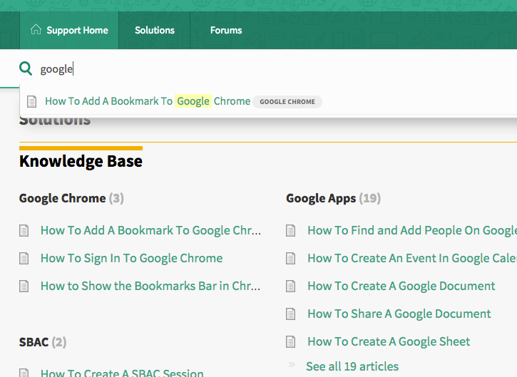
I can't get the the auto-populate working on our KB after switching to this theme. Everything else seems to be working. URL: http://wsesu.freshdesk.com
HI Larry,
I tried your portal's search and it seems to be working fine. And Looks like You forgot to add " portal home page" to your theme.
Thanks
Nithin
Hi Nithin,
Try a few others. What we found is that we had to go back into all our solutions and re-edit and re-save them. THEN they auto-completed. We haven't re-saved all of them yet, just a few. Tell me about portal home page?
Is the theme working now? I tried clicking on the preview and the layout of the page looks crazy, nothing is alligned.
Is there anyway to change the text on the links in the main navigation bar. So to change "Forums" for example. Or to add a couple more links to that bar?
Thanks,
David
David,
You will have to replace the label 'Forums' in the Header part under the Page-tabs section.
<div class="nav-link" id="page-tabs"> <a class="" href="/support/discussions"> Forums </a>
You can add more tabs by referencing them using the same method - <a class=" " href="Your link"> Tab name</a>
Cheers,
Aravind.S
Thanks Aravind,
But that seems to be what I already tried, but isn't working...
My code:
<nav class="page-tabs" >
<a data-toggle-dom="#header-tabs" href="#" data-animated="true" class="mobile-icon-nav-menu show-in-mobile"></a>
<div class="nav-link" id="header-tabs">
<a href="/support/home" class="{% if tab.tab_type == portal.current_tab %}active{% endif %}">Home</a>
<a href="/support/solutions" class="{% if tab.tab_type == portal.current_tab %}active{% endif %}">Solutions</a>
<a href="/support/discussions" class="{% if tab.tab_type == portal.current_tab %}active{% endif %}">Announcements</a>
<a class=" " href="/support/solutions/folders/5000109661">PPU Videos</a>
</div>
</nav>
And what my header bar looks like:
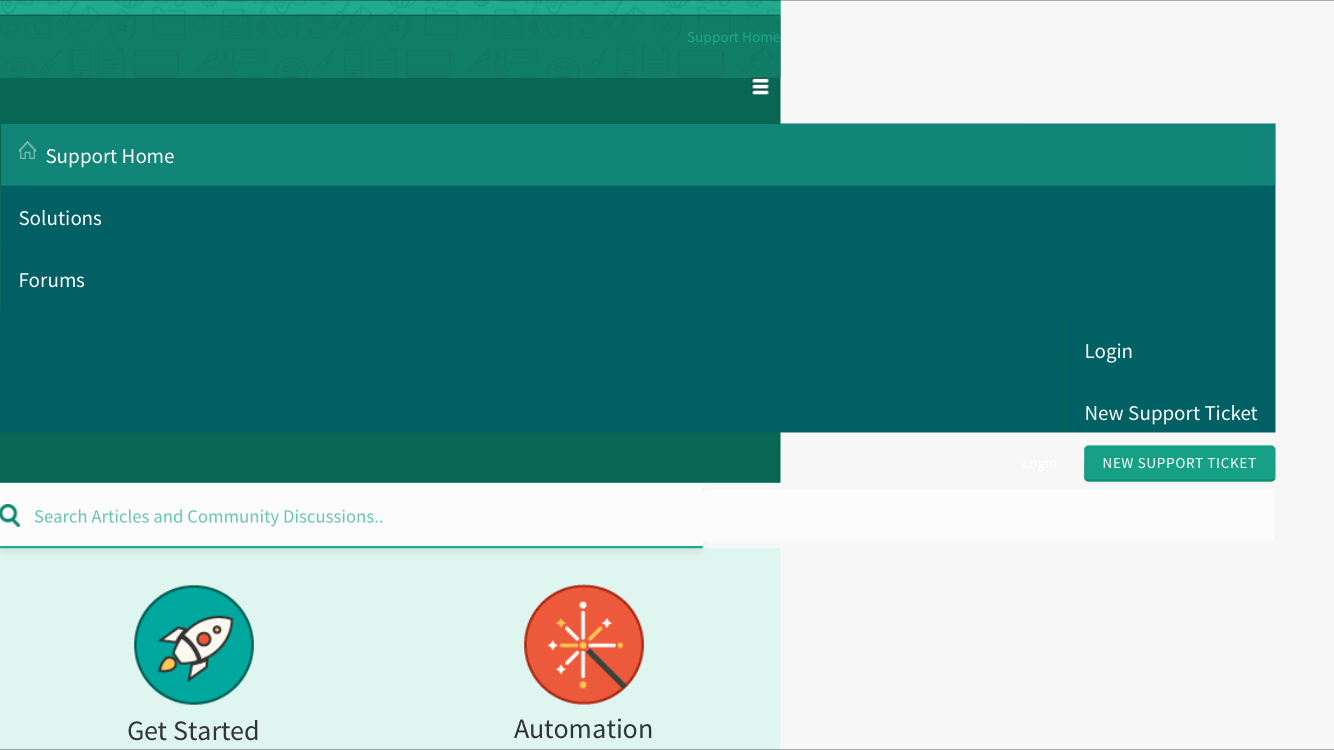
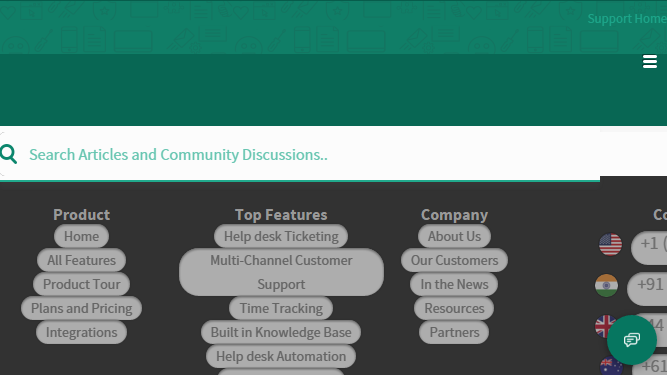
I like this theme a lot and have customized it to adapt to my own site but it has a major drawback: elements are broken in LANDSCAPE orientation on a mobile device! Any chance of fixing this? I've provided some screenshots (from an iPhone 6S) of where it's breaking. This also affects your own Freshdesk Support site! Portrait mode looks fine.
1. The menu and the New Support Ticket button stretch out too far.
2. The footer links turn into bubbles.
Thanks,
Mike
Mike,
For making this adaptable in Landscape for Mobile device we would need to increase the width attribute of Media query in the stylesheet.
Example:
The width might be given as 720px. So it will work for mobile portrait view, for landscape view width might be greater than the one which is styled. If we increase it the css would extend to landscape view also and by this way it will look good in Landscape too.
If you go to Stylesheet you would be able to find a query like shown below
@media(max-width: 720px){
}
or
@media(max-width: 45em){
}
We would need to increase these values to make it adaptable for Landscape view.
Regards,
Nikilesh
Hi Nikilesh,
So what is the most appropriate width? do you need to set a media query that has a difference between portrait mode and landscape mode?
I'm using the same media query as specified in the Freshdesk theme seen below. It's already at 75em.
@media (max-width: 75em){
.c-wrapper{
width: 900px;
}
.quick-link-lister li{
width: 49.6%;
}
.quick-link-lister h5{
width: 60%;
margin: 3px auto 0;
}
}