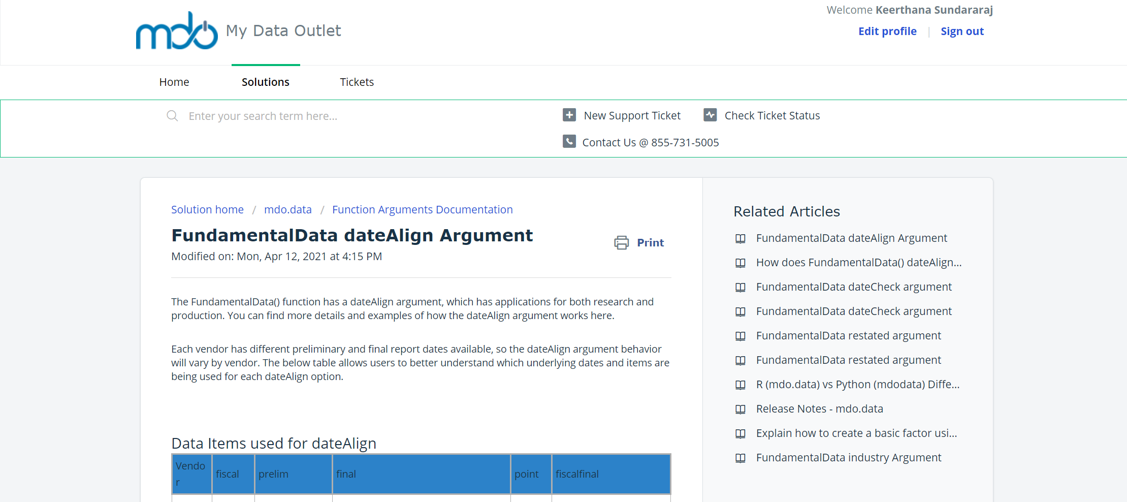
When I view the solution articles in Agent Mode it looks fine, but the formatting in Customer Portal is much skinnier (there is too much white space on either side of the article - see attached).


Any tables I include in the article don’t fit properly. Is there any way to format solution articles so they use more of the available space on the screen? Do I need to be on a specific paid tier or use a custom theme?

Hello @mdouser, you’d be able to customize the entire portal using portal customization options that are available from the Estate plan. This article would give you a clear idea of which sections you can customize and indeed, you’d be able to edit the format of the solution article view. 


On a different note, reagrding the additional whitespace, can you check if you are viewing the document in a full-screen mode (100% zoom)? I’ve added a screenshot below of how it looks from our end: 


For the issue with tables, can you try using the insert table option in the editor and check the formatting as well?


Insert table option

If the issue still persists, please write to suppor@freshdesk.com and our support buddies would love to help you further on this.  


Reply