Does anyone have a way that prevents the ticket screens from automatically scrolling to the latest entry?
As I audit my tickets, I have to keep scrolling up to change tabs or see the original ticket text…
Does anyone have a way that prevents the ticket screens from automatically scrolling to the latest entry?
As I audit my tickets, I have to keep scrolling up to change tabs or see the original ticket text…
Hello

I would try this out and see if it helps! Unless I misunderstand your inquiry lol
Hi Zach,
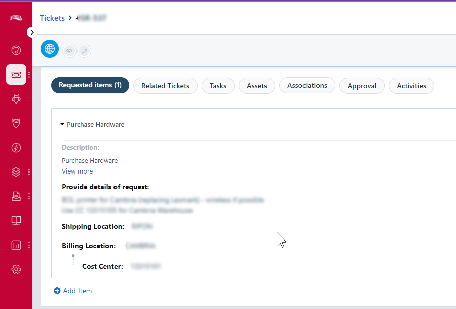
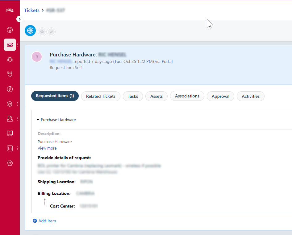
It’s a function of the web page, when I open a ticket and select, say, tasks, the screens scroll so that the Ticket header is hidden


to get to the second image, I have to manually scroll up.
Ahh I see what you mean. Mine does that too. I imagine if this irritates you then the new Modern Ticket UI is going to be problematic as well, as it segregates the ticket details into its own tab as well. So if you navigate to “Tasks” tab that will be all you see, you would have to travel back to the “Details” tab to see ticket details.
Hmm….
Hi
So at last it’s not scrolling scrolling scrolling

HTH
Bryn @ CYDEF
Just to follow up, the newly-released “new ticket experience” did away with the scrolling it seems. YAYYYYYYYY
Wishing everyone a happy new year 
Enter your E-mail address. We'll send you an e-mail with instructions to reset your password.