Question

Show chart as tabular

  • 5 September 2023
  • 3 replies
  • 41 views

Badge +2

Hi,

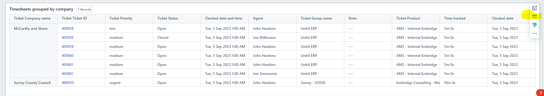
I want to show a set of information in tabular format.  When I create a chart there’s no option to choose Tabular.  I can only select things like summary chart or bar chart etc.


In some of the demo reports there are reports in there with Tabular style.


How do I display data as a chart like excel on the page and pick and choose columns to add to it?


3 replies

Badge +2

I’m not sure I explained myself properly, basically how do I recreate this into my own report?  You see the layout is “tabular”


Userlevel 7
Badge +13

I’m not sure I explained myself properly, basically how do I recreate this into my own report?  You see the layout is “tabular”


It depends how you setup your metric and grouped by for the widget/page/report. 

Userlevel 6
Badge +11

Hi @simmondsjon 

As Daniel mentioned, you need to at least use a Group by in order to enable that feature.

In the screenshot you have shared, you can notice the first column is highlighted in blue. That’s because that report, it was grouped by that field (Ticket Company Name).

Once you set a Group by condition, you will have the option to use Summary Table.


Hope this helps and clarifies.


Regards,

Reply