Question

Freshservice analytics tool delta figures

  • November 12, 2024
  • 2 replies
  • 42 views

Forum|alt.badge.img+2

Greetings everyone


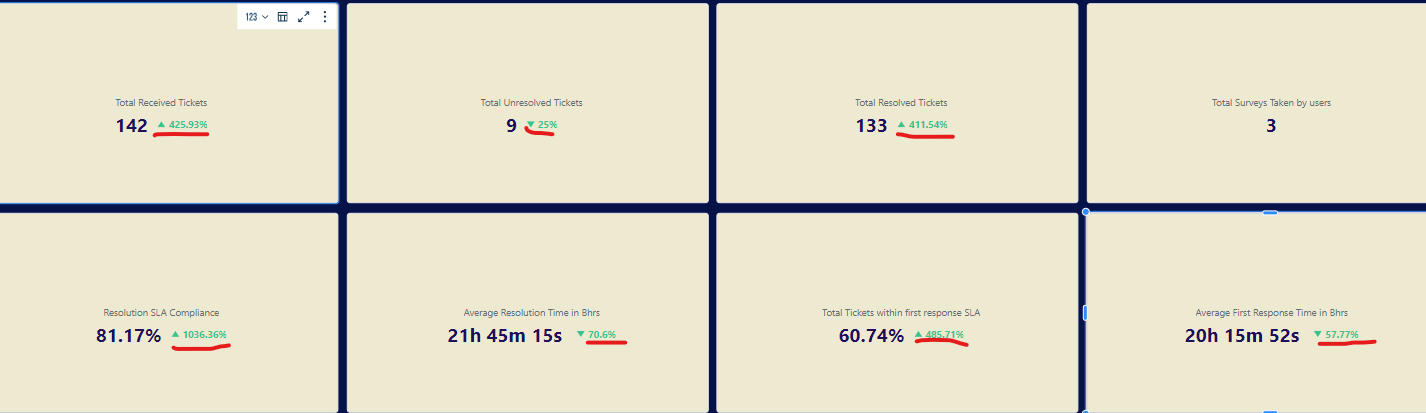
I was wondering about these green figures underlined in red and what they mean. I have gone through a lot of documentation here on freshservice but I couldn’t find any answer. If anyone could provide me with an answer, that would be great!


Did this topic help you find an answer to your question?

2 replies

Forum|alt.badge.img+11
  • Skilled Expert
  • 93 replies
  • November 13, 2024

I think those compare the currently shown data vs that of a previous set of data, based on your configured date range.

So, as an example, if your Analytics is currently showing data within the past 30 days, it compares the currently shown data against the data from 31-60 days ago.

Total Unresolved Tickets: current reading is ‘9’, which is down 25%, so previous data sample would have been ‘12’


Yasir5588
Community Debut
  • Community Debut
  • 2 replies
  • November 13, 2024

In Freshservice, the "delta figures" feature ddd 63, although not explicitly named, can be inferred to refer to tracking differences or changes in metrics over time. This is typically done by comparing data from two points to measure changes in key service desk performance indicators, such as ticket counts or resolution times.


Reply