


")
When grouping ticket stats by month, mine show January - December, and the current month is not highlighted, nor is the current month the final month on the chart.
Is there a way to make this so the current month is the far right of the graph?
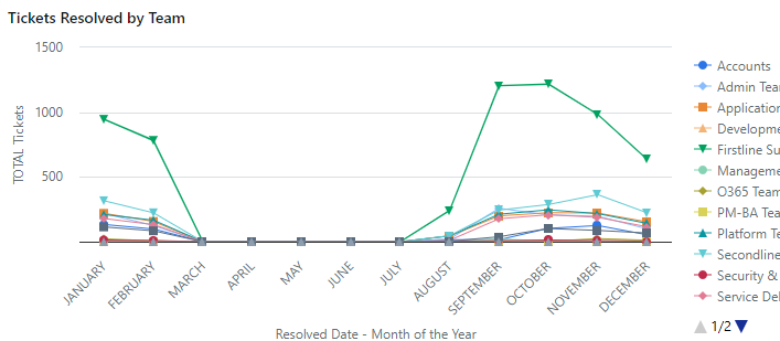
In my example, March is the current month, presently as I’ve only been active for 7 months, it’s easy to spot the current month, but once I hit August, the graph becomes more difficult to read at a glance.
Any ideas, or not possible?

