We recently started using Freshdesk and it's been working very well for us so far but the mobile interface has been problematic on iOS. The first is very minor, but I was wondering if there is information we are missing for the ticket. Next to the agent name the word "null" appears.


The second one actually makes the mobile interface unusable. Regardless of the interaction on the ticket detail screen, an error message pops up when trying to do *anything* with a ticket. This includes changing the status, assigning the ticket, or closing the ticket.


Screenshots attached.


Thanks!
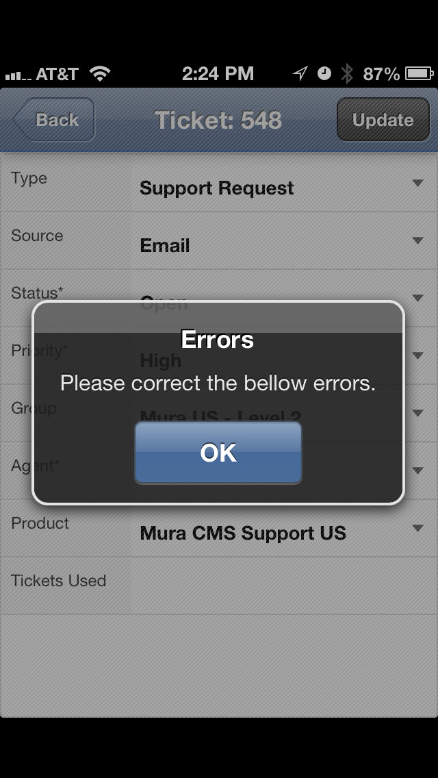
img_3418_11562.pngimg_3417_11562.png

Same here with android.


We found out that if you make changes to the ticket and accept the error message and hit the cancel button, go back to list, do a refresh....and voila... The changes are made.

So it is working but you have to ignore the error messages

.


Thanks, Remy. It wasn't clear if the status was actually being updated despite the error. Hopefully, this will get fixed and alleviate the confusion.


Does anyone know if this issue has been resolved?  


We are also having the same issues with the web portal & it's making our mobile users lives very difficult!


Hey everyone, 


The team is looking into this now and hope to fix it soon for all of you.


Will keep you updated for sure.


Thank you for writing to us in our Forums.


Annapoorna 


Getting null null on the web app since iphone upgrade to ios7

Hi Benjamin,


I also had these problems now and then. Although I don't have an Iphone, I solved it by going back to the login screen and logged myself in again. 


I solved this problem permanently by changing the shortcut I used to the normal url and not to the mobile one. When I use the normal Url (no /mobile at the end) I also go to the mobile site when I use my mobile device but the by your mentioned problem didn't occur anymore.


Hope this helps..


Remi


Hi,


On iPhone 5S, right-most buttons are not in the screen. There is no way to make the page to fit the screen (cannot zoom it out, changing to landscape orientation also doesn't help, it just makes page elements bigger, but right side is still chopped).


This is kind of a show-stopper for using the mobile version of the site from this device. Functionality is partially unavailable.


Can you please have a look at this?


Thanks,

Al


Yes, I noticed this also but hadn't had a chance to mention it yet. Thanks for posting Al.

Seems like it's already solved. Thanks!