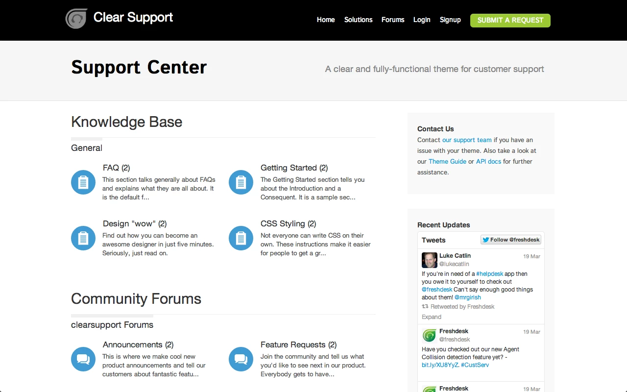
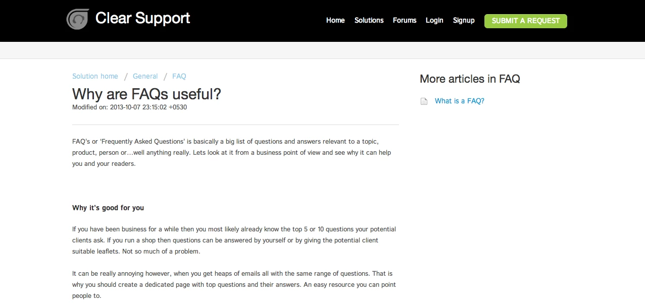
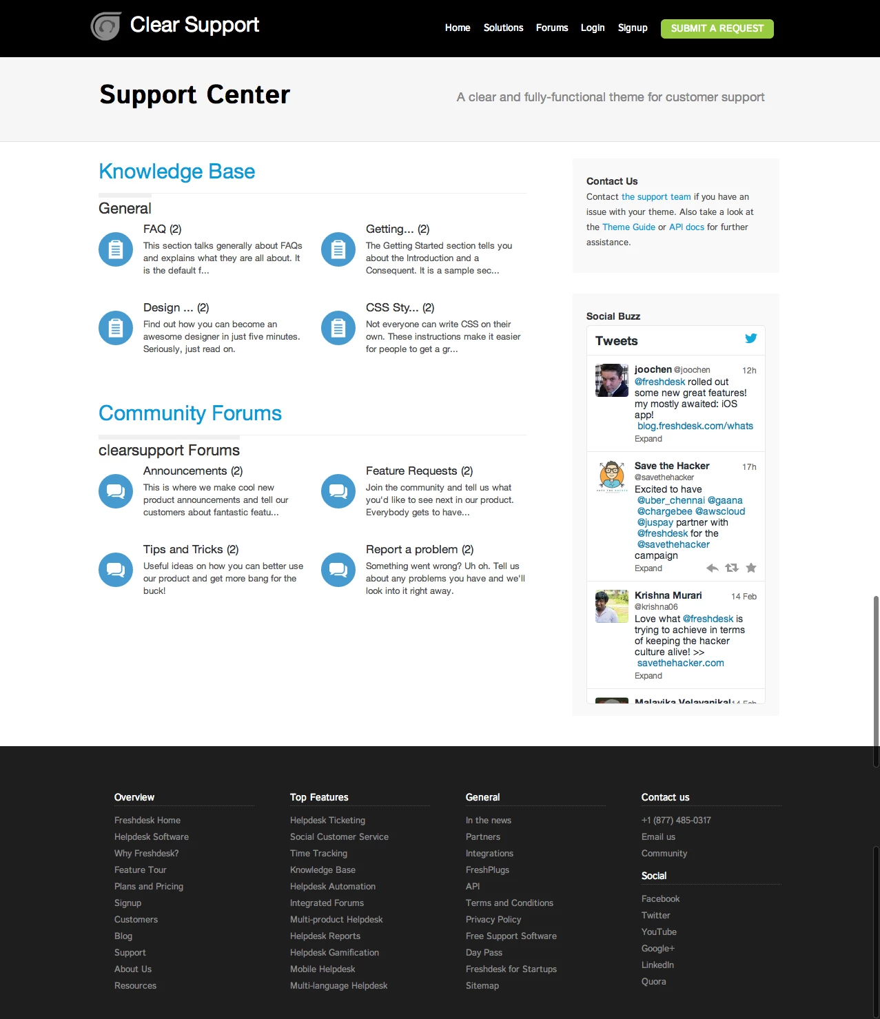
Update : The glitch in the Solutions Category Home has now been fixed.
Update: The header has been fixed to display "Edit Profile" and "Logout" links when a user is signed in to the portal.
I am really enjoying you theme.
The only thing I have noticed is when a user is signed in the logout and Edit Profile buttons don't work.
Any Suggestions?
Thanks,
Scarlett Hill
Hi Scarlett,
Thank you for your feedback. I had posted an update to the theme a couple of months ago that fixed the issue with the "Logout" and "Edit Profile" links on the header.
Please download the latest version (it's available in this page) and copy-paste the code from the Header.txt file into your Header section. That should fix your problem.
Ramesh
Hey Ramesh,
Thank you for you response. Unfortunately I am still having the same issue, even with the newly updated code.
It seems that the {{ portal.logout_path }} and {{ portal.signup_path }} links aren't working.
I am sorry about the confusion Scarlett.
Please replace the URLs in the header with these:
Edit Profile - "/support/profile/edit"
Logout - "/logout"
That should get the links to work again. I will see what I can do about the placeholders and get them fixed.
It works perfectly!!
Thank so much Ramesh!! Your support was wonderful. :-)
Hi. I really want to use this theme but I would like to add a large search section where the site currently says "A clear and fully-functional theme for customer support" similar to what the default theme has on the left under the logo (http://support.paylinedata.com)
Can you provide an updated file or advise where I could do this in the code?
Hi Steve,
Thank you for trying out the Clear Support theme.
You can add the search form easily. Please take a couple of minutes to do the following changes in your Freshdesk account.
1. Look for the class "resourcesheader-tagline" under the stylesheet tab (or text file if you haven't applied the theme yet) and replace it with this.
resourcesheader-tagline {
text-shadow: 0 1px 0px #FFF;
margin: 60px 40px 0 0;
display: block;
float: right;
font-family: "ProximaNovaLight","Helvetica Neue",Helvetica,Arial,sans-serif;
font-size: 18px;
color: #888;
vertical-align: baseline;
width: 500px;
}
2. Go to the Header section. Look for the <span> which has the text "A clear and fully-functional theme for customer support". Remove the text completely and add this code inside the <span> tags.
<form class="hc-search-form" autocomplete="off" action="/support/search" id="hc-search-form">
<div class="hc-search-input">
<input placeholder="Enter your search term here..." type="text" name="term" class="special ui-autocomplete-input" value="" rel="page-search" data-max-matches="10" autocomplete="off"><span role="status" aria-live="polite" class="ui-helper-hidden-accessible"></span>
</div>
<div class="hc-search-button">
<button class="btn btn-primary" type="submit" autocomplete="off">
<i class="mobile-icon-search hide-tablet"></i>
<span class="hide-in-mobile">
Search
</span>
</button>
</div>
</form>
Try saving and publishing the changes. You should now be able to see the search bar below the header where you wanted. Please let me know if you are able to get this working. If not, I will send you a modified version of the text files to your email address.
Thanks,
Ramesh
Hi Ramesh,
I use your Clear theme - it's a very good and beatifull project. Thank you for your job.
I have two questions, maybe you can help.
1. How can I setup a different icons to each category in Forums (like default Freshdesk theme)?
2. How can I add my own icons to each category in Solutions section?
Many thanks for your help. Happy new year .
Ramesh,
The search bar worked great! Thank you for that.
I am inerested in the answer to the last question as well.
I have noticed a couple of errors as well that seem to do with the previous comments by Scarlett:
- The Signup button does not do anything. Should this just be linked to /login?
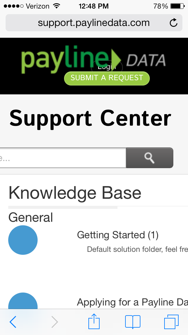
The Login button ends up being shown behind the logo on the mobile version and cannot be clicked.
- The width is not responsive on mobile in the Knowledge base section.
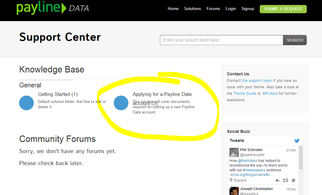
- On desktop version the article title is overlapping the description if the title is long enough to go onto two lines.
see attached screen shots and check out live site at https://support.paylinedata.com
Thank you and Happy New Year!
HI Tomasz,
Right now, the folder icons in the homepage use the same image.
You can show a different icon for each one by doing something like this in the Portal Home section.
{% folder.id == '1'%}
<div class="icon-1"><div></div></div>
{% endif %}
{% folder.id == '2'%}
<div class="icon-2"><div></div></div>
{% endif %}
{% folder.id == '3'%}
<div class="icon-3"><div></div></div>
{% endif %}
And then, you will have to add separate CSS classes for every icon you want to use.
.icon-1 div {
width: 50px;
height: 50px;
background: url('http://website.com/icon-1.png') center center no-repeat;
}
.icon-2 div {
width: 50px;
height: 50px;
background: url('http://website.com/icon-2.png') center center no-repeat;
}
.icon-3 div {
width: 50px;
height: 50px;
background: url('http://website.com/icon-3.png') center center no-repeat;
}
You'll have to host the icon files yourself or put them up on the internet somewhere. The same trick works for forum categories as well. Let me know if this works for you.
Thanks,
Ramesh
Steve,
The signup link should point to "/support/signup". Sorry about the confusion there.
You can fix the knowledge base headings issue by truncating the article names to 20 characters. Please use this:
<h2 class="home-h2"><a href="{{folder.url}}">{{folder.name | strip_html | truncate: 20}} ({{ folder.articles_count }})</a></h2>
I have been wanting to make this theme responsive for sometime now, but I haven't gotten the time to do it yet. I will let you know once push out an update :)
The header.txt is not displaying appropriately in my Clear Support Theme. Are there files missing in the Code folder?
Viewing the preview theme on mobile the head seems to be broken and the theme seems to have some dead space to the right. Is this fixed in the files provided?
I am really enjoying you theme
Thanks for the Clear support theme! We have already customised the theme and integrated it to our website. One thing we can't figure out. The preview theme uses big icons on the frontpage and displays the category description. Our implementations displays a few questions within the category as you can see in the screenshot.
How can we use the big icon layout? Thanks in advance.
Hi,
Twitter widget not getting loaded is Fixed in the new version 1.3
Cheers,
Parsu